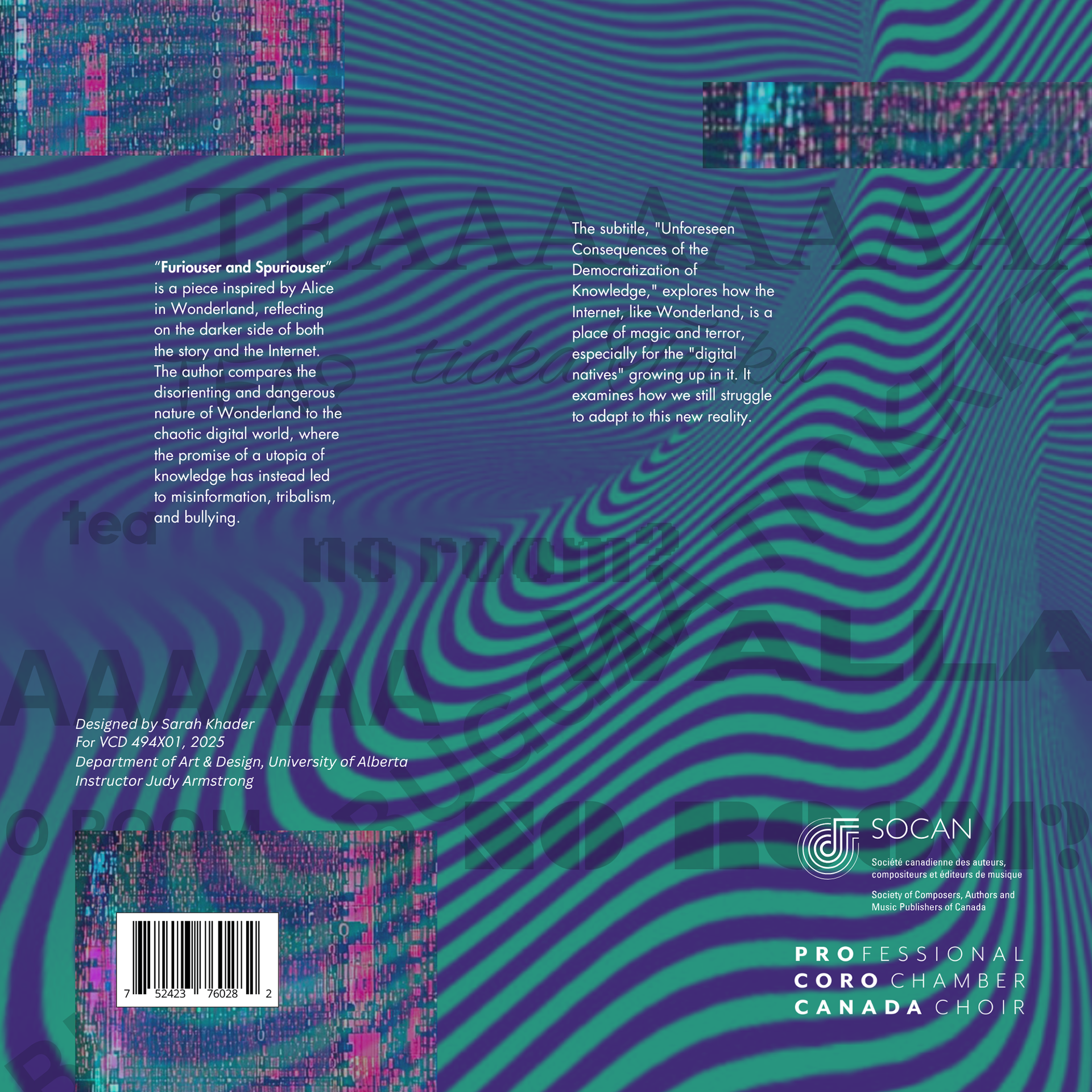
Furiouser & Spuriouser album cover reflects the chaotic and disorienting nature of both Wonderland and the digital world. Distorted patterns and glitch-like textures symbolize misinformation and the overwhelming nature of digital spaces, while typography and structured elements provide contrast, mirroring the way music balances tension and resolution. Color choices further enhance the emotional tone, using deep purples and electric greens to evoke an unsettling yet immersive atmosphere. Through these visual decisions, the project successfully demonstrates how design can interpret musical qualities, creating a unified and expressive piece of communication.
Specs 12x12 Record Sleeve


REFELECTION:
By deeply analyzing the music score, I was able to interpret its structure, rhythm, and emotional shifts through design. The wavy, distorted patterns reflect the dynamic flow of the composition, much like the unpredictable and immersive nature of sound. Just as the music builds tension and release, the design contrasts structured typography with chaotic digital glitch elements, mirroring the disorienting themes of the piece.
The integration of color, texture, and layering was directly inspired by the depth of the score. The deep purples, electric greens, and fragmented digital textures evoke the eerie, unsettling qualities of the music, much like its exploration of the darker sides of knowledge and the internet. Understanding the pauses and crescendos in the composition helped me strategically use space and contrast, ensuring that the design visually resonated with the music's intensity. Presenting this to Jason Noble himself was an incredible experience, as it reinforced the idea that music and design are deeply connected in their ability to convey emotion and meaning.

